CSS Grid: Complete Guide to CSS Grid Layout
When we build websites, we need to arrange elements into different layouts.
We can create layouts using several CSS techniques:
- Normal document flow
position- Flexbox
- CSS Grid
- Tables in some specific cases
We have already seen how powerful Flexbox is for creating layouts.
So a natural question is:
If Flexbox can create layouts, why do we need CSS Grid?
The answer is simple:
Flexbox is mainly designed for one-dimensional layouts, while CSS Grid is designed for two-dimensional layouts.
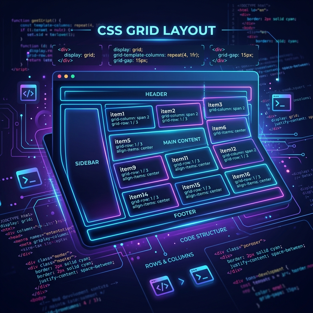
With Grid, we can control rows and columns together, making it especially useful for complete page layouts, dashboards, galleries, card layouts, and other structured interfaces.
1. What is CSS Grid?
CSS Grid is a two-dimensional layout system that allows us to arrange elements into rows and columns.
Think of Grid like a matrix.
For example:
┌────────┬────────┬────────┐
│        │        │        │
│        │        │        │
├────────┼────────┼────────┤
│        │        │        │
│        │        │        │
├────────┼────────┼────────┤
│        │        │        │
│        │        │        │
└────────┴────────┴────────┘
Here we have:
- Rows
- Columns
- Cells
- Grid lines
- Grid tracks
This makes Grid extremely useful when we need precise control over a layout.
2. Why Do We Need Grid After Flexbox?
Flexbox is excellent for arranging items in one direction.
For example:
Item 1 → Item 2 → Item 3 → Item 4
or:
Item 1
   ↓
Item 2
   ↓
Item 3
But a website layout often needs both directions at the same time.
For example:
┌──────────────────────────────┐
│            Header            │
├────────────┬─────────────────┤
│            │                 │
│  Sidebar   │     Content     │
│            │                 │
├────────────┴─────────────────┤
│            Footer            │
└──────────────────────────────┘
This is where Grid becomes extremely useful.
Simple rule
Flexbox → 1D Layout
Grid    → 2D Layout
Flexbox works primarily along one axis at a time.
Grid allows us to control rows and columns together.
3. Grid Container and Grid Items
To use CSS Grid, we first make the parent element a Grid container.
.container {
    display: grid;
}
Example HTML:
<div class="container">
    <div>Box 1</div>
    <div>Box 2</div>
    <div>Box 3</div>
    <div>Box 4</div>
</div>
Here:
.container → Grid Container
Box 1      → Grid Item
Box 2      → Grid Item
Box 3      → Grid Item
Box 4      → Grid Item
Just like Flexbox, we apply display: grid to the parent, and its direct children become Grid items.
4. Important CSS Grid Terminology
Before working with Grid properties, we need to understand a few important terms.
Grid Line
Grid lines are the lines that define the boundaries of rows and columns.
For three columns:
1        2        3        4
│        │        │        │
├────────┼────────┼────────┤
│        │        │        │
└────────┴────────┴────────┘
Notice:
3 columns require 4 vertical grid lines.
Similarly:
2 rows require 3 horizontal grid lines.
5. Grid Cell
A Grid Cell is the smallest individual unit created by the intersection of one row and one column.
┌──────────┐
│   Cell   │
└──────────┘
For example, if we have:
grid-template-columns: repeat(3, 1fr);
grid-template-rows: repeat(2, 100px);
we have:
┌────────┬────────┬────────┐
│ Cell   │ Cell   │ Cell   │
├────────┼────────┼────────┤
│ Cell   │ Cell   │ Cell   │
└────────┴────────┴────────┘
That's 6 Grid cells.
6. Grid Track
A Grid Track is the space between two adjacent grid lines.
There are two types:
- Row Track
- Column Track
Simply:
Row Track    → horizontal
Column Track → vertical
For example:
┌────────┬────────┬────────┐
│        │        │        │
├────────┼────────┼────────┤ ← Row Track boundary
│        │        │        │
└────────┴────────┴────────┘
7. Creating Rows with grid-template-rows
We can define the size of Grid rows using:
grid-template-rows
Example:
.container {
    display: grid;
    grid-template-rows: 100px 100px;
}
This creates two rows:
┌─────────────────────────┐
│        Row 1            │ 100px
├─────────────────────────┤
│        Row 2            │ 100px
└─────────────────────────┘
We can define different sizes too:
grid-template-rows: 100px 200px 150px;
This creates three rows with different heights.
8. Creating Columns with grid-template-columns
To define columns, we use:
grid-template-columns
Example:
.container {
    display: grid;
    grid-template-columns: 100px 100px 100px;
}
This creates three columns:
┌────────┬────────┬────────┐
│        │        │        │
│ 100px  │ 100px  │ 100px  │
│        │        │        │
└────────┴────────┴────────┘
9. Creating Rows and Columns Together
We can define both:
.container {
    display: grid;

    grid-template-rows: 100px 100px;

    grid-template-columns: 100px 100px 100px;
}
This creates:
- 2 rows
- 3 columns
- 6 cells
Result:
┌────────┬────────┬────────┐
│ Box 1  │ Box 2  │ Box 3  │
├────────┼────────┼────────┤
│ Box 4  │ Box 5  │ Box 6  │
└────────┴────────┴────────┘
10. row-gap
We can create space between rows using:
row-gap: 10px;
Example:
.container {
    display: grid;
    grid-template-columns: repeat(2, 1fr);
    row-gap: 10px;
}
The horizontal space between rows will be 10px.
11. column-gap
To create space between columns:
column-gap: 10px;
Example:
.container {
    display: grid;
    grid-template-columns: repeat(3, 1fr);
    column-gap: 10px;
}
12. gap
If we want the same gap between rows and columns, we can use:
gap: 10px;
This is equivalent to:
row-gap: 10px;
column-gap: 10px;
We can also specify different row and column gaps:
gap: 20px 10px;
The first value is the row gap.
The second value is the column gap.
gap: row-gap column-gap;
13. The fr Unit
One of the most useful features of CSS Grid is the fractional unit, written as:
fr
fr represents a fraction of the available space.
For example:
grid-template-columns: 1fr 1fr 1fr;
This divides the available space into three equal parts.
Imagine the container has 3000px of available width.
3fr = 3000px

1fr = 1000px
So:
┌──────────┬──────────┬──────────┐
│ 1000px   │ 1000px   │ 1000px   │
└──────────┴──────────┴──────────┘
14. Different fr Values
We don't have to make every column equal.
Example:
grid-template-columns: 1fr 2fr;
The total is:
1fr + 2fr = 3fr
If 900px is available:
1fr = 300px
2fr = 600px
Result:
┌──────────┬────────────────────┐
│  300px   │       600px        │
└──────────┴────────────────────┘
This is extremely useful for layouts such as:
Sidebar | Main Content
where the sidebar might take 1fr and the content 2fr.
15. The repeat() Function
Sometimes we need to repeat the same value multiple times.
Instead of:
grid-template-columns: 1fr 1fr 1fr;
we can write:
grid-template-columns: repeat(3, 1fr);
Syntax:
repeat(number, value)
Example:
repeat(3, 1fr)
means:
1fr 1fr 1fr
Another example:
grid-template-rows: repeat(4, 100px);
means:
100px 100px 100px 100px
16. Basic Grid Example
Let's combine everything we've learned.
.container {
    display: grid;

    grid-template-columns: repeat(3, 1fr);
    grid-template-rows: repeat(2, 100px);

    gap: 10px;
}
HTML:
<div class="container">
    <div>Box 1</div>
    <div>Box 2</div>
    <div>Box 3</div>
    <div>Box 4</div>
    <div>Box 5</div>
    <div>Box 6</div>
</div>
Result:
┌────────┬────────┬────────┐
│ Box 1  │ Box 2  │ Box 3  │
├────────┼────────┼────────┤
│ Box 4  │ Box 5  │ Box 6  │
└────────┴────────┴────────┘
17. Grid Child Properties
Until now, we mainly worked with the Grid container.
Now let's control individual Grid items.
Important Grid item properties include:
grid-column
grid-row

justify-self
align-self
place-self
18. grid-column-start and grid-column-end
Grid items can span multiple columns.
Suppose we have three columns:
1        2        3        4
│        │        │        │
├────────┼────────┼────────┤
│        │        │        │
└────────┴────────┴────────┘
Notice that three columns have four vertical grid lines.
If we want a header to span the entire width:
.header {
    grid-column-start: 1;
    grid-column-end: 4;
}
The header starts at line 1 and ends at line 4.
Result:
┌──────────────────────────┐
│          HEADER          │
└──────────────────────────┘
19. grid-column Shorthand
Instead of:
.header {
    grid-column-start: 1;
    grid-column-end: 4;
}
we can use:
.header {
    grid-column: 1 / 4;
}
This is the shorthand.
Remember:
grid-column: 1 / 4;
means:
Start at grid line 1
End at grid line 4
It does not mean four columns.
20. grid-row-start and grid-row-end
We can do the same thing with rows.
Example:
.sidebar {
    grid-row-start: 2;
    grid-row-end: 4;
}
Or using shorthand:
.sidebar {
    grid-row: 2 / 4;
}
This makes the item occupy the area between row lines 2 and 4.
21. Grid Spanning
Grid allows an item to span multiple rows or columns.
For example:
.item {
    grid-column: 1 / 3;
}
The item spans two columns.
We can also use the span keyword:
.item {
    grid-column: span 2;
}
This means:
Make this item span two columns.
Similarly:
.item {
    grid-row: span 2;
}
means the item spans two rows.
22. Building a Complete Website Layout
Now we can use Grid to build a common website layout.
┌──────────────────────────────────┐
│              Header              │
├──────────────┬───────────────────┤
│              │                   │
│   Sidebar    │      Content      │
│              │                   │
├──────────────┴───────────────────┤
│              Footer              │
└──────────────────────────────────┘
HTML:
<div class="layout">

    <header class="header">
        Header
    </header>

    <aside class="sidebar">
        Sidebar
    </aside>

    <main class="content">
        Main Content
    </main>

    <footer class="footer">
        Footer
    </footer>

</div>
CSS:
.layout {
    display: grid;

    grid-template-columns: 1fr 2fr;
    grid-template-rows: 100px 300px 100px;

    gap: 10px;
}

.header {
    grid-column: 1 / 3;
}

.sidebar {
    grid-row: 2 / 3;
}

.content {
    grid-column: 2 / 3;
}

.footer {
    grid-column: 1 / 3;
}
This is where the real power of CSS Grid becomes clear.
23. justify-self
Now let's learn how to position an individual item inside its Grid cell.
justify-self is a Grid item property.
It controls the item's horizontal alignment inside its cell.
Example:
.box {
    justify-self: center;
}
Common values:
justify-self: start;
justify-self: center;
justify-self: end;
justify-self: stretch;
Example:
.box {
    justify-self: end;
}
The item moves toward the end of its cell.
24. align-self
align-self controls the vertical alignment of an individual Grid item inside its cell.
Example:
.box {
    align-self: center;
}
Common values:
align-self: start;
align-self: center;
align-self: end;
align-self: stretch;
For example:
.box {
    align-self: end;
}
The item moves toward the bottom/end of its Grid cell.
25. place-self
If we want to set both horizontal and vertical alignment for one item, we can use:
place-self
Example:
.box {
    place-self: center;
}
This is shorthand for:
.box {
    justify-self: center;
    align-self: center;
}
So:
place-self
    ↓
justify-self + align-self
26. justify-items
Now we move back to the Grid container.
justify-items controls the horizontal alignment of all Grid items inside their cells.
Example:
.container {
    justify-items: center;
}
Common values:
justify-items: start;
justify-items: center;
justify-items: end;
justify-items: stretch;
Important difference
justify-self  → one item
justify-items → all items
27. align-items
align-items controls the vertical alignment of all Grid items inside their cells.
Example:
.container {
    align-items: center;
}
Common values:
align-items: start;
align-items: center;
align-items: end;
align-items: stretch;
28. Parent vs Child Grid Properties
This is an important concept to remember.
Grid Container / Parent
display: grid;

grid-template-columns
grid-template-rows

gap
row-gap
column-gap

justify-items
align-items
Grid Item / Child
grid-column
grid-row

justify-self
align-self
place-self
A simple rule:
Parent controls the Grid structure and default alignment.
Child controls its own placement and alignment.
29. justify-items vs justify-self
This is one of the most common areas of confusion.
justify-items
Applied to the parent:
.container {
    justify-items: center;
}
It affects all Grid items.
justify-self
Applied to an individual child:
.box {
    justify-self: center;
}
It affects one Grid item.
Same idea:
justify-items → all children
justify-self  → one child

align-items   → all children
align-self    → one child
30. Grid Alignment vs Grid Placement
Don't confuse these two concepts.
Placement
grid-column
grid-row
These determine where the item occupies space in the Grid.
Alignment
justify-self
align-self
place-self
These determine where the item sits inside its Grid area/cell.
For example:
.box {
    grid-column: 2 / 4;
}
changes its Grid placement.
While:
.box {
    justify-self: center;
}
changes its alignment inside that area.
31. CSS Grid and Flexbox Together
Grid and Flexbox are not competitors.
In real-world websites, we often use both together.
Grid
Use Grid for the overall page structure:
Header
Sidebar
Main Content
Footer
Flexbox
Use Flexbox inside individual components:
Icon + Text
Button + Text
Navbar
Card content
Form controls
Example:
.dashboard {
    display: grid;
    grid-template-columns: 250px 1fr;
}
Then inside a card:
.card {
    display: flex;
    justify-content: center;
    align-items: center;
}
A useful mental model:
Grid
 ↓
Overall Layout

Flexbox
 ↓
Component Layout / Alignment
This is not a strict rule—Flexbox can create larger layouts and Grid can be used inside components—but it is a useful starting point.
32. Responsive CSS Grid
Grid becomes even more useful when creating responsive layouts.
Suppose we have three columns on desktop:
.container {
    display: grid;
    grid-template-columns: repeat(3, 1fr);
}
Desktop:
┌────────┬────────┬────────┐
│        │        │        │
├────────┼────────┼────────┤
│        │        │        │
└────────┴────────┴────────┘
On mobile, we might want one column.
@media (max-width: 768px) {
    .container {
        grid-template-columns: 1fr;
    }
}
Mobile:
┌──────────┐
│          │
├──────────┤
│          │
├──────────┤
│          │
└──────────┘
This allows the same Grid structure to adapt to different screen sizes.
33. minmax() for Responsive Grid
Another useful Grid function is:
minmax()
Example:
grid-template-columns: repeat(3, minmax(200px, 1fr));
This means each column can be:
- At least
200px - Up to
1fr
This is useful when building flexible layouts.
34. auto-fit and auto-fill
For responsive card layouts, we can combine Grid with:
repeat()
minmax()
auto-fit
Example:
.container {
    display: grid;
    grid-template-columns: repeat(
        auto-fit,
        minmax(200px, 1fr)
    );

    gap: 20px;
}
Now the browser can automatically fit as many columns as the available space allows.
This is especially useful for:
- Product cards
- Blog cards
- Image galleries
- Dashboard cards
- Portfolio layouts
35. grid-template-areas
CSS Grid also provides a very readable way to describe page layouts using named areas.
Example:
.layout {
    display: grid;

    grid-template-columns: 200px 1fr;

    grid-template-areas:
        "header header"
        "sidebar content"
        "footer footer";
}
Then assign areas:
.header {
    grid-area: header;
}

.sidebar {
    grid-area: sidebar;
}

.content {
    grid-area: content;
}

.footer {
    grid-area: footer;
}
This creates:
┌──────────────────────────┐
│          Header          │
├──────────┬───────────────┤
│ Sidebar  │    Content    │
├──────────┴───────────────┤
│          Footer           │
└──────────────────────────┘
grid-template-areas can make larger layouts easier to understand.
36. Common CSS Grid Properties — Quick Reference
| Property | Used For |
|---|---|
display: grid |
Creates Grid container |
grid-template-columns |
Defines columns |
grid-template-rows |
Defines rows |
gap |
Row + column gap |
row-gap |
Gap between rows |
column-gap |
Gap between columns |
grid-column |
Places item across columns |
grid-row |
Places item across rows |
grid-column-start |
Column starting line |
grid-column-end |
Column ending line |
grid-row-start |
Row starting line |
grid-row-end |
Row ending line |
justify-items |
Horizontal alignment of all items |
align-items |
Vertical alignment of all items |
justify-self |
Horizontal alignment of one item |
align-self |
Vertical alignment of one item |
place-self |
Both alignments for one item |
grid-area |
Assigns a named Grid area |
grid-template-areas |
Defines named layout areas |
37. Important CSS Grid Functions and Units
fr
1fr
2fr
Divides available space into fractions.
repeat()
repeat(3, 1fr)
Repeats a Grid track definition.
minmax()
minmax(200px, 1fr)
Defines minimum and maximum track sizes.
auto-fit
repeat(auto-fit, minmax(200px, 1fr))
Automatically fits available columns.
auto-fill
repeat(auto-fill, minmax(200px, 1fr))
Creates as many possible tracks as the available space allows.
38. Flexbox vs CSS Grid
Both are powerful layout systems, but they solve different kinds of problems.
| Flexbox | CSS Grid |
|---|---|
| One-dimensional layout | Two-dimensional layout |
| Mainly row OR column | Rows AND columns |
| Great for components | Great for structured layouts |
| Content-driven alignment | Structure-driven layout |
| Excellent for navigation | Excellent for dashboards |
| Excellent for small UI components | Excellent for page layouts |
justify-content |
Grid placement properties |
align-items |
Grid alignment + placement |
| Flexible one-axis arrangement | Explicit two-axis arrangement |
Simple Example
Flexbox:
.navbar {
    display: flex;
    justify-content: space-between;
    align-items: center;
}
Grid:
.dashboard {
    display: grid;
    grid-template-columns: 250px 1fr;
}
39. When Should You Use Flexbox?
Use Flexbox when the layout is primarily one-dimensional.
Examples:
- Navbar
- Navigation items
- Buttons
- Card header
- Icon + text
- Form controls
- Horizontal/vertical alignment
- Small component layouts
Example:
.navbar {
    display: flex;
    justify-content: space-between;
    align-items: center;
}
40. When Should You Use Grid?
Use Grid when you need control over rows and columns.
Examples:
- Dashboard
- Website layout
- Image gallery
- Product grid
- Admin panel
- Card layouts
- Header/sidebar/content/footer structures
Example:
.dashboard {
    display: grid;
    grid-template-columns: 250px 1fr;
    gap: 20px;
}
41. Can Grid and Flexbox Be Used Together?
Absolutely.
A real application might look like:
Page
│
├── CSS Grid
│     ├── Header
│     ├── Sidebar
│     └── Main Content
│
└── Flexbox
      ├── Navbar
      ├── Cards
      ├── Buttons
      └── Forms
For example:
.page {
    display: grid;
    grid-template-columns: 240px 1fr;
}

.navbar {
    display: flex;
    justify-content: space-between;
    align-items: center;
}
The two technologies complement each other.
42. Common CSS Grid Mistakes
Mistake 1: Confusing Grid Lines and Columns
If you have:
grid-template-columns: repeat(3, 1fr);
you have:
3 columns
4 vertical grid lines
Therefore:
grid-column: 1 / 4;
spans all three columns.
Mistake 2: Confusing justify-items and justify-self
Remember:
justify-items → parent → all children
justify-self  → child → one item
Mistake 3: Confusing grid-column with alignment
grid-column: 1 / 3;
controls placement.
justify-self: center;
controls alignment inside the Grid area.
Mistake 4: Using Grid for Everything
Grid is powerful, but that doesn't mean every layout needs Grid.
Sometimes Flexbox is simpler.
Choose the layout system based on the problem.
43. A Practical Grid Project
After learning the individual properties, build a complete dashboard.
For example:
┌─────────────────────────────────────────┐
│                Header                   │
├──────────────┬──────────────────────────┤
│              │                          │
│   Sidebar    │       Dashboard          │
│              │                          │
│              │  ┌────┬────┬────┐       │
│              │  │Card│Card│Card│       │
│              │  └────┴────┴────┘       │
│              │                          │
│              │  ┌─────────┬─────────┐  │
│              │  │ Chart   │ Activity│  │
│              │  └─────────┴─────────┘  │
└──────────────┴──────────────────────────┘
Use:
Grid for the overall dashboard.
Use:
Flexbox inside individual cards and components.
This gives students practical experience with both layout systems.
44. CSS Grid Learning Flow
A good learning sequence is:
CSS Grid
   ↓
Why Grid?
   ↓
1D vs 2D
   ↓
Grid Container
   ↓
Grid Items
   ↓
Grid Lines
   ↓
Grid Cells
   ↓
Grid Tracks
   ↓
Rows & Columns
   ↓
Gap
   ↓
fr
   ↓
repeat()
   ↓
Grid Placement
   ↓
grid-column
   ↓
grid-row
   ↓
Spanning
   ↓
Grid Alignment
   ↓
justify-items
   ↓
align-items
   ↓
justify-self
   ↓
align-self
   ↓
place-self
   ↓
grid-template-areas
   ↓
Responsive Grid
   ↓
Grid + Flexbox
   ↓
Real Project
45. Final Takeaway
CSS Grid is a two-dimensional layout system designed to work with rows and columns.
The most important concepts to remember are:
Grid Container
Grid Item
Grid Line
Grid Cell
Grid Track
The most important properties are:
display: grid;

grid-template-columns
grid-template-rows

gap
row-gap
column-gap

grid-column
grid-row

justify-items
align-items

justify-self
align-self
place-self

grid-template-areas
And the most useful Grid functions/units are:
fr
repeat()
minmax()
auto-fit
auto-fill
Finally, remember:
Flexbox is mainly for one-dimensional layouts.
Grid is designed for two-dimensional layouts.
And in real-world development, you do not have to choose only one.
Grid and Flexbox work extremely well together.
Use Grid when you need to structure rows and columns.
Use Flexbox when you need to arrange and align elements along one direction.
The goal is not to memorize every property.
The goal is to understand which layout problem each tool is designed to solve.